Lenore Miller is a well-known leader in the Hunter region and change management community and has established her reputation largely through word of mouth marketing methods. She came to us for a new brand and website after recognising the need to increase her business identity to help scale her business.
She was also looking to create an identity that tied together her business values, her why, and the important change management expertise she offers clients.
Lenore wanted to extend on her successful reputation in the Hunter region by attaching her identity to a brand that reflected her and her team. In line with this progression for her business, she also wanted to develop a website that would easily communicate her key messaging, brand, showcase their success with clients and highlight the team.
Our graphic design team developed a new brand identity for Agile Change Solutions which is designed to capture the professionalism and knowledge of the team, but also reflect the creativity and unique solutions they offer clients.
As part of our brand briefing process, we asked Lenore to provide feedback on her favourite colours. From here we chose colours to align with her preferences and to position the brand. The bold yet calming colours that were chosen differentiate Agile from competitions, but also give the business a modern, fresh and collaborative identity. Each colour was strategically chosen for the way it weaved in with Agile’s services and values.
The green tone reflects a balance of logic and emotion, and gives off motifs of growth, trust and dependability – all important aspects of the business. The blue is calming, which is reflective of the value they bring to their clients. The added touch of a gradient was to highlight the fluidity and effortless adaptability of the organisation. A gradient is confident but also shows the subtle change from one state to another, which reflects Agile Change Solution’s approach to working with their clients.
In line with the new colouring, we also produced a new logo and font suite. The logo incorporates a simple yet effective icon that can be leveraged across marketing channels. It signifies an on/off switch, which links to new technologies and solving problems, both elements that lie at the heart of what Agile does for its clients.
We were inspired to choose a symbol that showed the team’s ability to transform a business, culture, system or team that was facing issues into a functional, creative system or structure. The added element of the circle within the logo is an organic shape that reflects the team’s fluidity and adaptability to solving problems. The icon is designed to share the key message that Agile Change Solutions does not provide a one-size-fits-all approach to clients. We used clean, simple and modern fonts across the brand, including on the website, to ensure the brand retained relevance and accessibility.


A B C D E F G H I J K L M N O P Q R S T U V W X Y Z
a b c d e f g h i j k l m n o p q r s t u v w x y z
Our graphic design team developed a new brand identity for Agile Change Solutions which is designed to capture the professionalism and knowledge of the team, but also reflect the creativity and unique solutions they offer clients.
As part of our brand briefing process we asked Lenore to provide feedback on her favourite colours. From here we chose colours to align with her preferences and to position the brand. The bold yet calming colours that were chosen differentiate Agile from competitions, but also give the business a modern, fresh and collaborative identity. Each colour was strategically chosen for the way it weaved in with Agile’s services and values.
The green tone reflects a balance of logic and emotion, and gives off motifs of growth, trust and dependability – all important aspects of the business. The blue is calming, which is reflective of the value they bring to their clients. The added touch of a gradient was to highlight the fluidity and effortless adaptability of the organisation. A gradient is confident but also shows the subtle change from one state to another, which reflects Agile Change Solution’s approach to working with their clients.
In line with the new colouring, we also produced a new logo and font suite. The logo incorporates a simple yet effective icon that can be leveraged across marketing channels. It signifies an on/off switch, which links to new technologies and solving problems, both elements that lie at the heart of what Agile does for its clients. We were inspired to choose a symbol that showed the team’s ability to transform a business, culture, system or team that was facing issues into a functional, creative system or structure. The added element of the circle within the logo is an organic shape that reflects the team’s fluidity and adaptability to solving problems. The icon is designed to share the key message that Agile Change Solutions does not provide a one-size-fits-all approach to clients. We used clean, simple and modern fonts across the brand, including on the website, to ensure the brand retained relevance and accessibility.


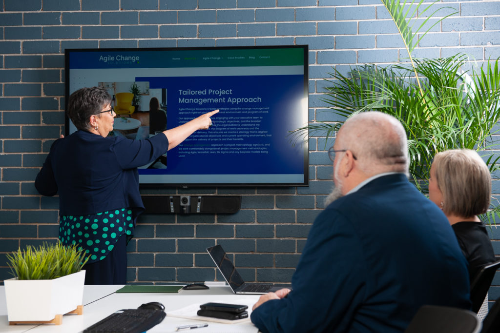
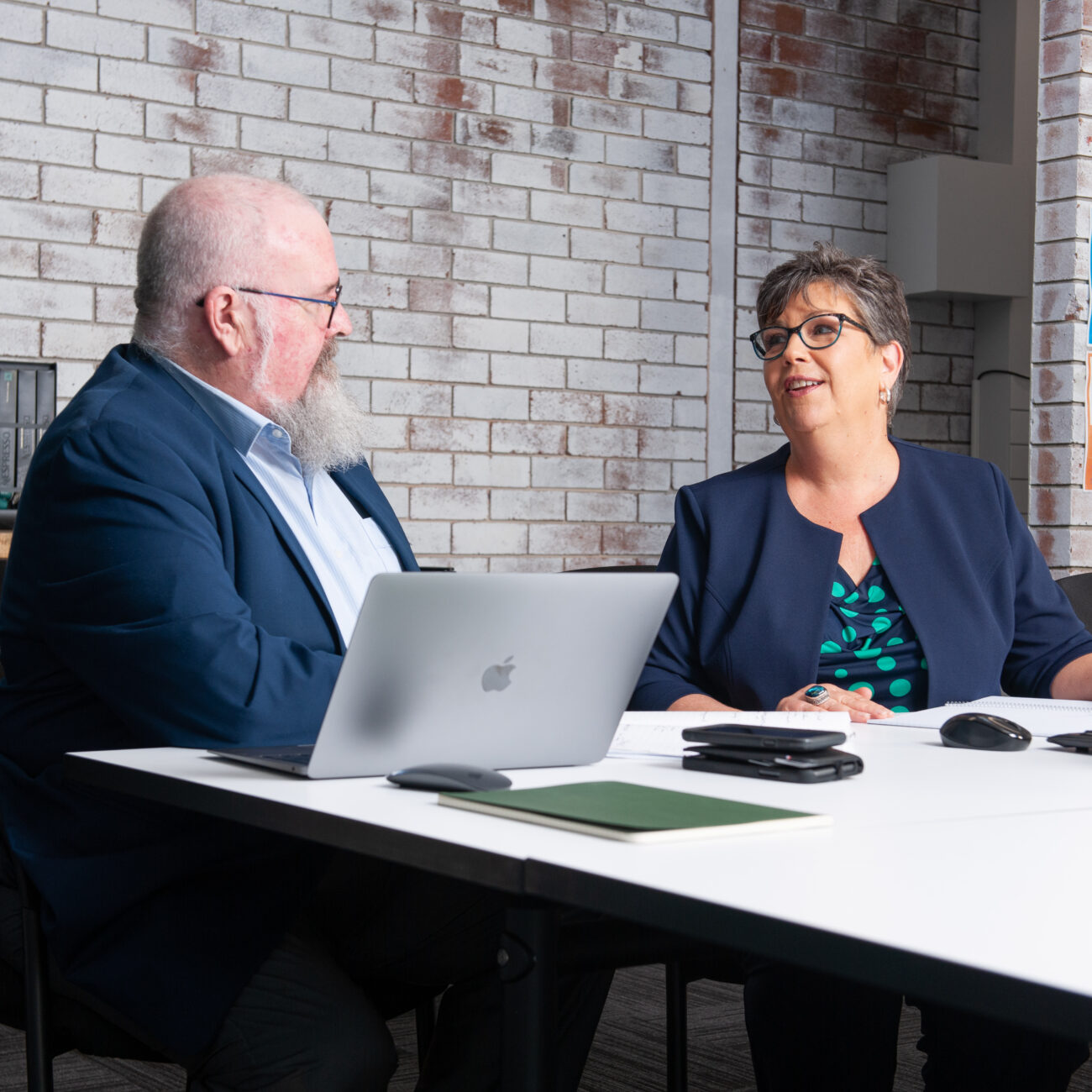
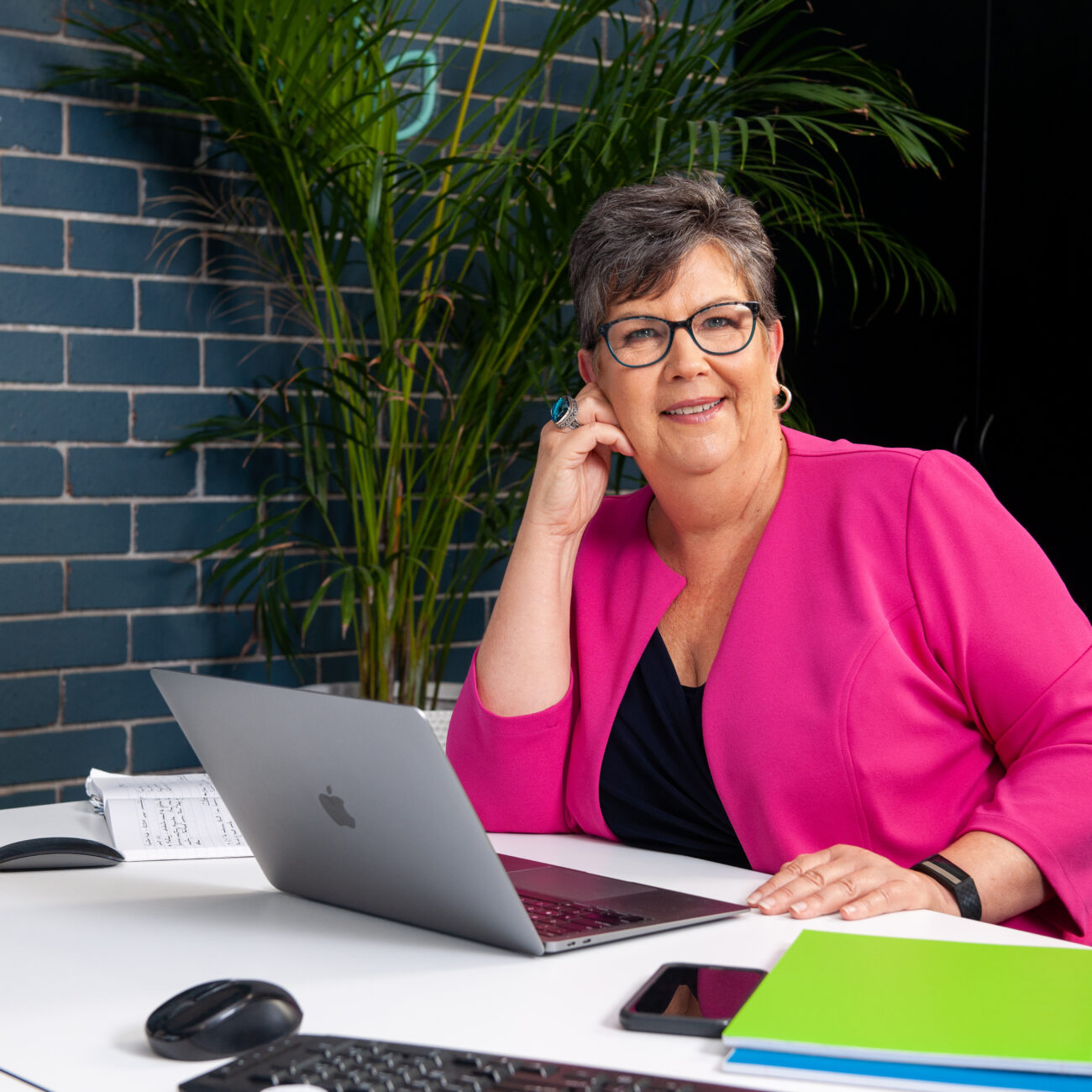
As part of the website and brand development process, we identified the need for a professional photoshoot that would support Agile Change Solution in taking the next step for their business in terms of brand identity and professionalism.
Our team designed a storyboard of imagery to help refine the professional look required and to ensure imagery captured served multiple uses and purposes. This helped Lenore and her team understand the types if images required so that they could plan what outfits and props to bring along to the photoshoot.
In a two-hour photoshoot we managed to take a large number of images in various settings, which could be used in a variety of ways. The resulting image stock captures her brand and team perfectly, and we’ve received positive feedback regarding how engaging the imagery is across all marketing channels.
Before coming to us, Lenore didn’t have a website as her operations were largely based on word-of-mouth. This presented an exciting opportunity for us to create the Agile Change Solutions website from scratch and raise the professional profile of the business.
Our focus for the website was around a user-friendly experience, engaging and impactful content, and easy navigation experience. The website needed to be responsive, designed for SEO optimisation and simple, yet impactful.
The copywriting content was carefully crafted for SEO but also told the brand narrative and clearly articulated the services, key brand messages and key actions we wanted visitors to take.
We also saw the opportunity to showcase positive experiences by featuring case studies, which clearly showed the impact that Agile Change Solutions has on its clients.
Feedback on the brand, imagery and website have been outstanding, and Lenore and the team are extremely happy with their digital shopfront and the reflection on their business’ modern, professional approach.
From simple to complex, The Marketing GP’s experienced web and user experience designers can create a beautiful, responsive, custom-built site that best reflects your business and services.
The Marketing GP operates on the lands of the Awabakal people. We pay our deepest respects to the Awabakul Elders past, present, and emerging, honouring their living connection to the land, waters, and sky. We acknowledge that sovereignty was never ceded. We acknowledge that we benefit from living and working on these lands.
This land is Aboriginal land, always was, is, and always will be.
We use Cookies to offer you a better browsing experience, analyse site traffic, personalise content, and serve targeted advertisement. By continuing to browse this site you will consent to our use of cookies.
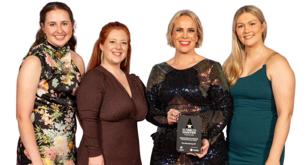
WINNER!
Employer of Choice
20 Employees and under award
We recently won the Business Hunter Employer of Choice award for 2023! See how we took out the top spot by reading the blog below.
