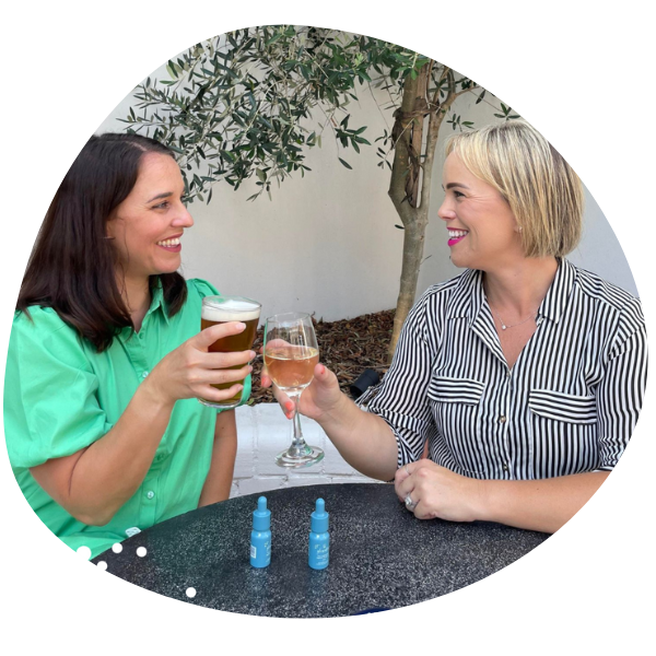
The team were looking for a brand which was cohesive with their core message: which is to build a community and enrich the lives of people who want to get more out of life.
Our graphic designers took to the stage to create a brand which is attractive and engaging for its young and more feminine audience, drawing on multi-purpose and social-friendly design elements that are trendy but timeless.

We crafted a striking logo that is versatile, engaging and easily services the brand as new products launch. Featuring bubbles and organic lines, the logo references cheer, bubbles and happiness, which are in line with its philosophy and offering.
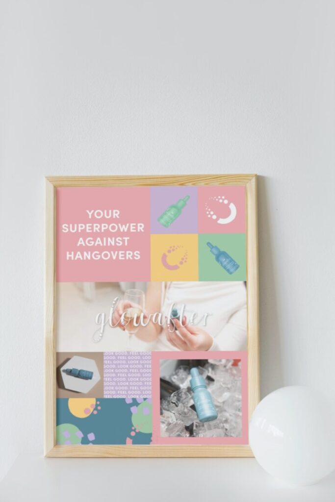
We developed a suite of attractive colouring and patterns that can be used across different marketing assets. We created a broad scope of design elements to cater to the longevity of the brand and to allow a colouring that can be aligned to new product launches. They were fun, a little bit flirty, and perfect for social media.
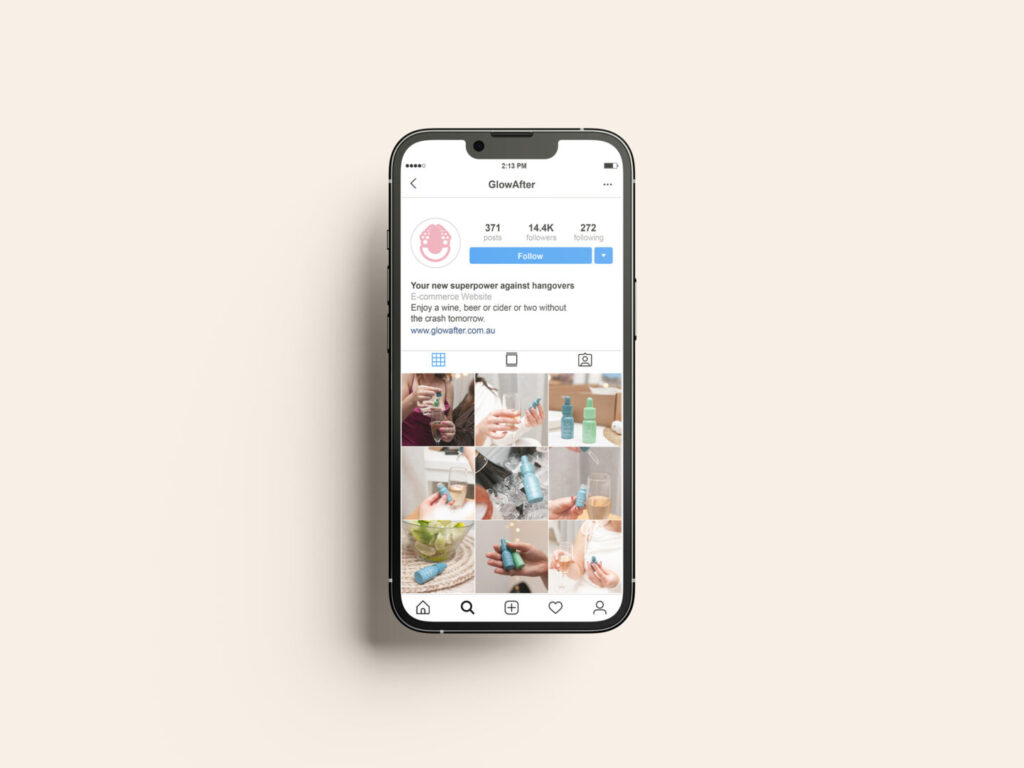
The GlowAfter team wanted the imagery and video content on the website to instantly connect with the target audience.
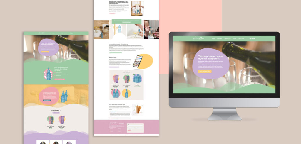
The website was developed with the branding colours and design elements as the focus – maintaining that fun and colourful theme throughout.
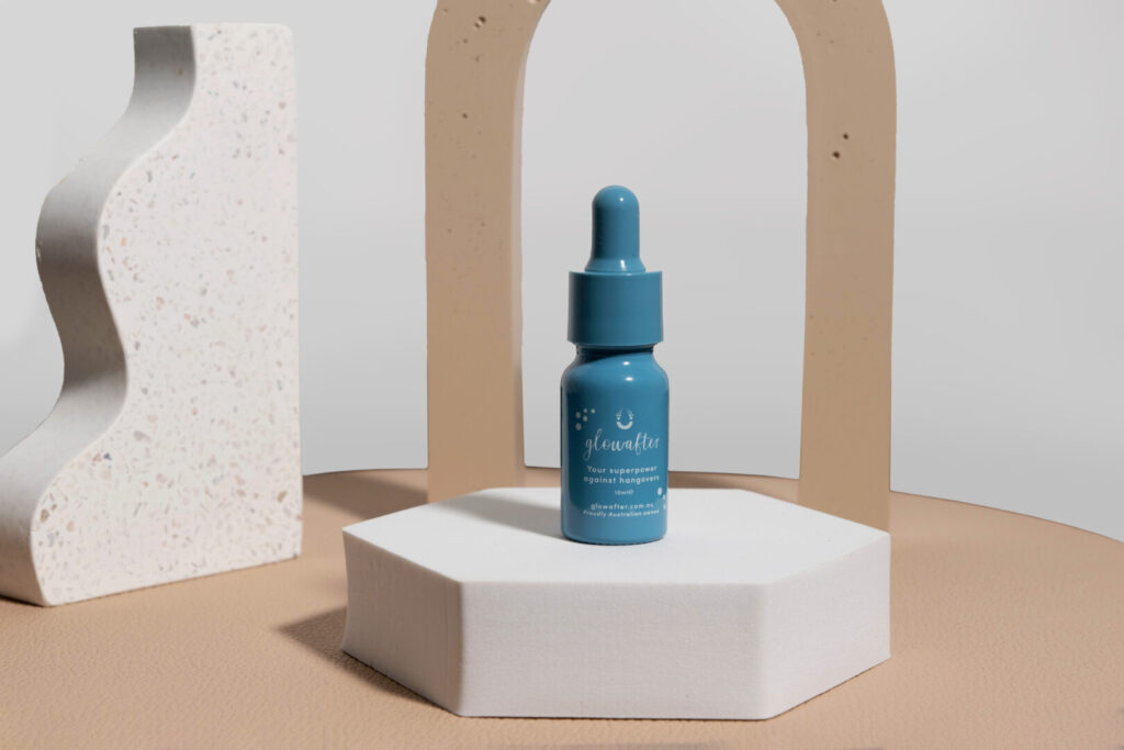
The GlowAfter bottles were designed to be consumer-friendly, trendy and attractive. The client wanted their product to be so attractive that people would happily keep it in their handbag or leave it on the table whilst out, like a lipstick.
We stripped back the usual medical look of similar products and created a design that is trendy and beautiful, with clear messaging.
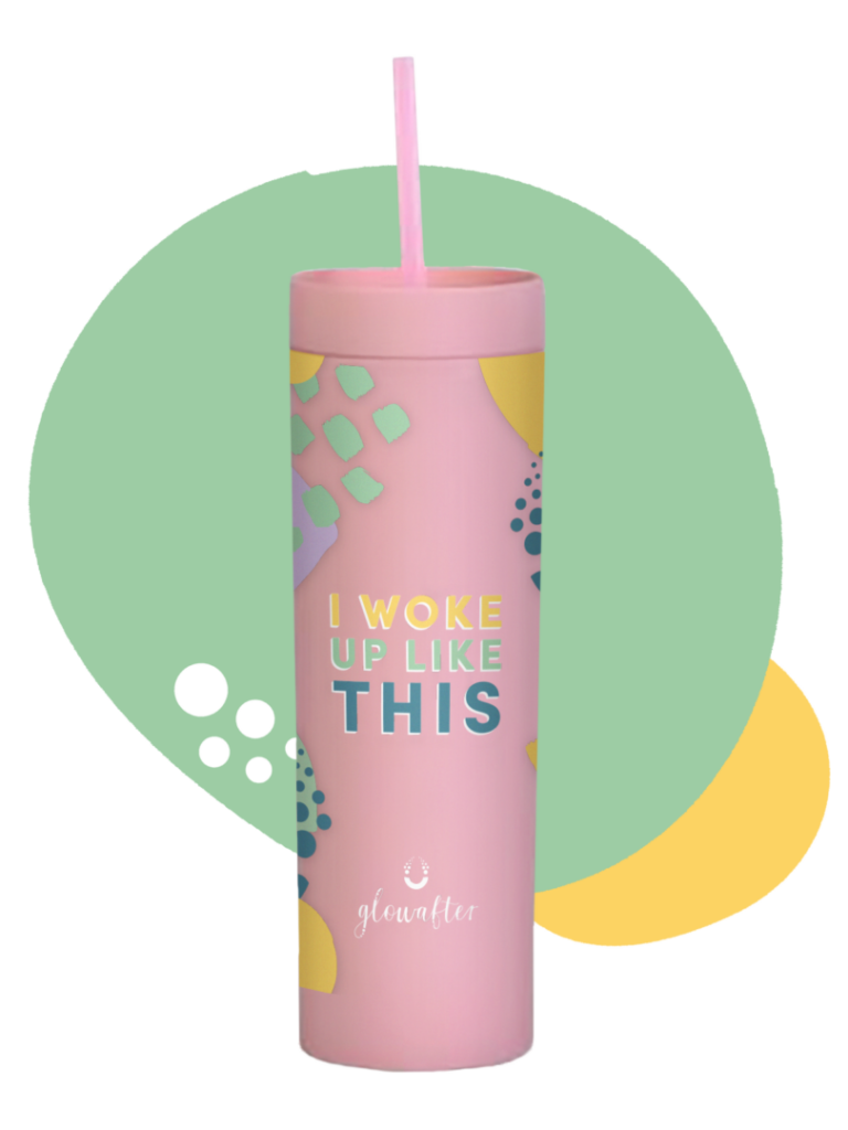
We used the colouring, cheerful concept and knowledge of the target audience to design packaging for the supplementary products.
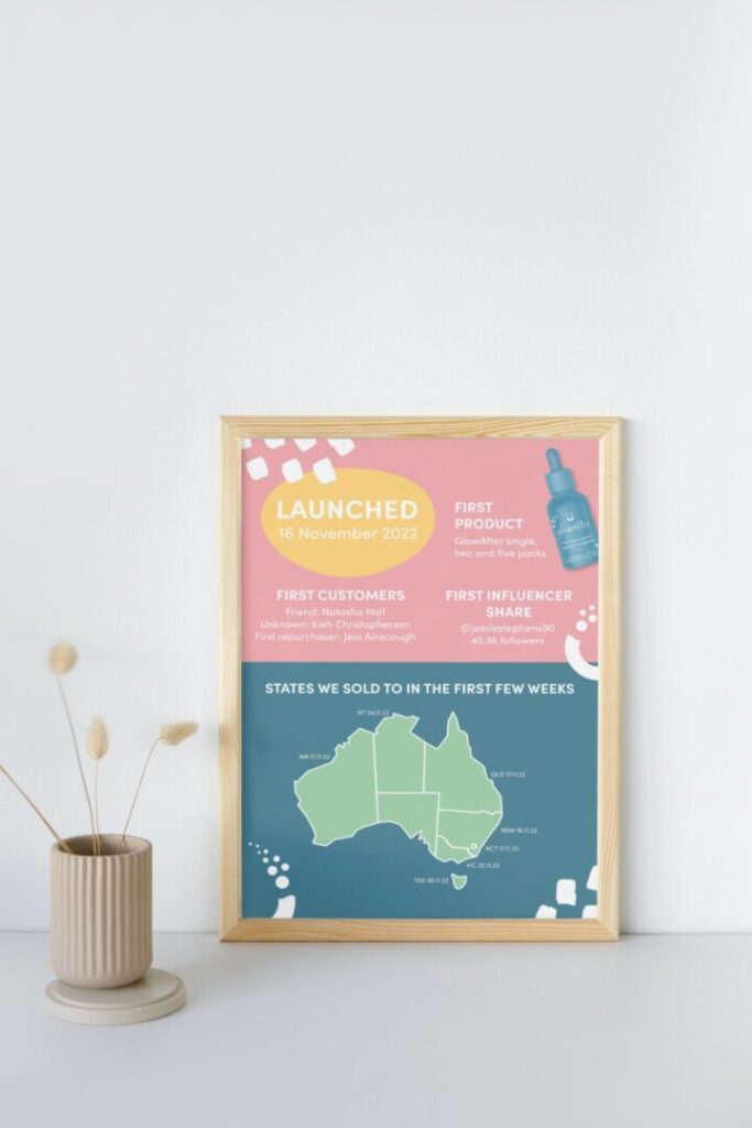
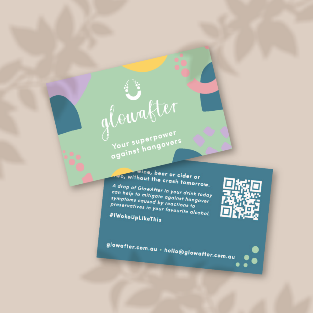
We supported the product range with collateral, such as postcards and in-store product stangs, which aligns to their larger branding and is focused on community-building. Language was enticing, the design was attractive, and the outcome was impeccable.

The feedback we received from the GlowAfter team on their branding, website, training and brand collateral has been amazing.
We were able to develop a brand from scratch that aligned with GlowAfter’s values, would maintain relevance in the market, and reflect the feel-good philosophy of the brand.
We wanted the GlowAfter brand to foster a connection with like-minded people who want to get more out of life. We also wanted the product and brand elements to stand out and stay socially relevant when they launched. And finally, we wanted a brand with longevity that can involve as the product range does.
We’ve had overwhelmingly positive feedback and are proud of presenting a brand that is attractive, engaging and versatile to our market. We were really happy with the pattern that was designed, it is almost youthful, colourful, fun and engaging, which are underlying words that we associate with the brand.
